- Please leave comments for participation credit
An animated simplified overview of the very basics.
Inge Druckrey – Teaching to See
I recommend setting the speed to 1.25 if her voice is too slow for you. I especially enjoy the Beethoven poster puzzle and cameo with Steve Jobs.

Please click on the glossary of common type terminology. Along with the FAQs, it may answer many font-related questions.
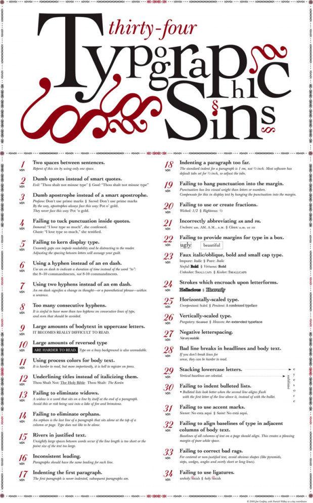

These videos really help you notice the little, but important, differences between good typography and bad typography. I feel like they were very helpful with studying for the midterm also.
LikeLike
I thoroughly enjoyed the first video! The images illustrated the information in a very helpful, straight-forward manner. I think the terms were explained simply and clearly. The explanation of the different kinds of fonts (and how to use them) was also communicated easily.
The way the second video was put together was very interesting, but a little distracting. I think the overall video was more entertaining, than informative, though it did make its point. It recaps the history of type in a fun, narrative way. I particularly enjoyed the explanation of how one form of type developed into another, and how we got to the digital stage. The third video was very insightful in viewing typography/hand-lettering in a technical way. It went over a lot of formal qualities like line, negative space, color, weight. It is fascinating to see the correlations made between disciplines. I especially liked the part where the history of writing was explained as “an elegant little conflict between the conservative eye and radical hand”.
LikeLike
The first video definitely my favorite. I liked how they incorporated animation and movement with the type and type lesson. Definitely inspired me for future projects on After Effects. It also gave me a lot of information on what pairings work well with each other.
The second video was nice but really was a reiteration of the type movie we watched in the auditorium.
LikeLike
The first video was very insightful and I learned a lot of tips about typography that are easy to remember. The second video really brought me back in time and I really learned about the history of typography. It is good to know the history of typography and see how different it is from today.
LikeLike
I enjoyed the first video because it explained the basics of type thoroughly and in an entertaining format. It was very helpful and easy to follow. The second video had nice visuals but not as easy to follow because the background sound was too over powering.
LikeLike
The videos are interesting, I am really into them. The animation is will made. They help me simplified the typography classification, like the differences between serif and sans serif. and how to make my design special by using the same font.
LikeLike
I really enjoy the video, first one I know more information about the front, second one I know about the font history, the third one is great too. love them!
LikeLike
The first video is really helpful as it shows the meaning of kerning, leading and tracking in a clear way. I learned a lot from the first two video, especially the rule”less is more”. Most of time if I chose more than four kinds of font in my project, it looks chaos and tragedy. It is always appreciated to use less font. The third video is also helpful although the voice is very slow. She talks about a story of her student who is lack of self-confidence of his design ability. She pushes the student to success by limiting the elements he can use in design. it is interesting that sometimes limitations of color palette, elements and styles won’t limit the design ability and creations, but will lead artists to creative and amazing results.
LikeLiked by 1 person
The first video is a great overview on the basics of type and familiarizing yourself with the terminology of design.
the second video is a great supplement to the first so you know how designers before us achieved there goals with the available technology and how they couldn’t do things we can do now like previewing before printing.
LikeLike
I enjoyed the first two videos, and the last one was all right. What I enjoyed most was the collage video that explains the history of typography. The first video also helped review typography terms that are helpful for anyone who’s interested in this. The videos really helped me study for the midterm 🙂 Thanks Cindy ❤
LikeLiked by 1 person
The first video was nice because it physically showed the difference between the types of fonts as the words were animated. The second video was adorable and a good video for a quick recap of the history we already studied. I did enjoy how the second video went beyond Apple and showed how typography is seen today on any screen. The third video gave many great examples of how to look at type and design. Inge really showed the importance of negative space. While we do use the computer with different fonts we should pay attention to the movement of letters. It was also nice to see that while geometric shapes may match, but they can optically be deformed.
LikeLiked by 1 person
Honestly, I think the two most important takeaways, at least for me, were that less is more and there should always be a certain hierarchy to the information. The second video was funny, it was great to find out the reason behind that horrible squished text from the middle ages. And the calligraphy from the last one was so satisfying, maybe we could take a lecture day to practice some lettering?
LikeLiked by 1 person
The first video demonstrated some type terminologies such as what leading, tracking and kerning means really easily and clearly. I really enjoy the second video showed the history of type in a short video. As for the third video, I also like the Beethoven’s poster.
LikeLiked by 1 person
I like the first video, informative. In the second video, I felt like they were doing too much with the sound and background music. It provided good info, but felt like it was trying to hard. The third video of course was quite long and I found myself having some trouble staying focused on it. Maybe thats just my problem, but the first two videos I felt were a lot better.
LikeLiked by 1 person
The first two videos were fun adorable animations and for a moment I thought I enjoyed typography finally, and then I reached the last video. While it was very informative and some parts were interesting I must say those who truly enjoy this stuff are a rare breed. Bravo to you all.
Comic sans will rise again.
LikeLiked by 2 people
I appreciate your honesty Mathew!
LikeLike
The Typography video and the Type Glossary will definitely be very help for the midterm, thanks for sharing! Also Inge Druckrey has a very soothing voice!
LikeLiked by 1 person
It’s exciting to learn the fun facts about typography in the history, and also I’m impressed by how powerful it changed the design world. I love how typography translate the information and also brings more meaning behind the forms.
LikeLiked by 1 person
Often in typography, I tend to think most about stylization and the shapes inside of font/font shapes. I also tend to not think about complimentary fonts with other fonts as well (I’ll get better overtime). These videos helped me open my mind more in type, as well as appreciate even the smallest details more. I agree with Hallie, negative space in typography is beautiful, as well as the combination of shapes and hierarchy of type. Typography is vital in design, and help project the message of your art, as well as make something more readable. Without good type, it greatly effects the message you’re trying to send out, or the overall art piece. Learning about the history of type was also an interesting video, and the documentary we watched last class was really great and has helped me look at type in new ways!
I really enjoy how fun and informational these videos are as well 🙂
LikeLiked by 1 person
What ?
LikeLike
I think it interesting how there are so many detail that go into good typography. I really liked the first video because it showed how a minor tweak in tracking or letting can really change a lot. I also thought the history of type was very informative.
LikeLiked by 1 person
I really enjoyed learning about calligraphy and how
LikeLiked by 1 person
Story of Inge made me think a lot how I should see the world differently as a designer. I realized that I’m only focusing on the shape, not considering enough the space between two shapes. For example, I never thought about space between G and S, and how beautiful the negative space is. Some of her class exercises seems good for sketchbook ideas too.
LikeLiked by 1 person
I enjoyed how visually entertaining the “Fun History of Type” video was, the whole collage theme worked really well to inform me about history and such.
LikeLiked by 1 person
Typography seemingly appears to be a niche topic that only graphic designers or those with a discerning eye care about, but most overlook the important role that it plays in everyday life. I especially enjoyed the first two videos explaining the basics of typography – they’re a good way to introduce those new to the world of design into basic type.
But to be honest, I sometimes wonder if the general population as a whole really would notice bad kerning or that “Comic Sans” or “Papyrus” is a bad font since they use it so much, so is good typography only reserved for type snobs or graphic designers? It shouldn’t be that way 😦
LikeLiked by 1 person